
Project Overview
Client
AllTrails
Services
UX Design/Research & Development
Deliverables
Hi-Fi Mockups
Mobile Prototype
GitHub Pages Link
Timeline
3 Weeks
My Role
Tools
My Work
Figma File
About the Project
AllTrails is an outdoor adventure app commonly used for recreational activities such as hiking and mountain biking. Users can access a database of information, such as trail maps, reviews, and images to assist in planning an outdoor adventure. AllTrails also has been testing a Community Beta feature that, according to user research, has been underperforming in its goal to increase community engagement.
This redesign presents an approach to improve user engagement by rebranding the AllTrails Community Beta feature as AllTrails Groups, a space where hiking groups can collaborate to create hiking plans that best fit the needs of everyone.

My Process

Understanding our Users
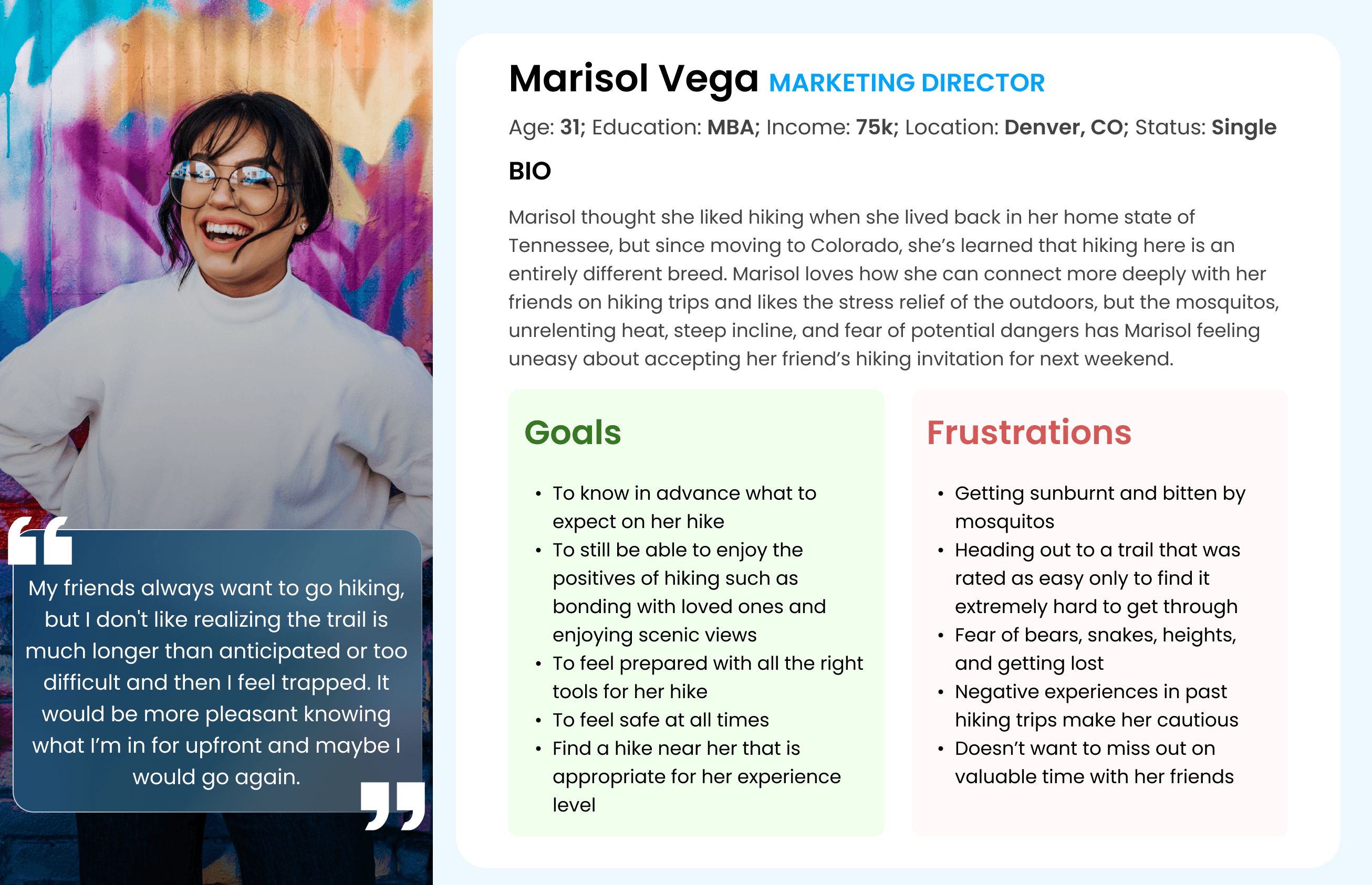
In the spirit of empathetic design, the design team began with user research by defining research goals, conducting user interviews, and issuing surveys to our target demographic. To ensure that our data and results were strategically utilized to create a human centered product, we synthesized the interview and survey insights into a user persona that represented the interests of our users. Meet Marisol:
Proto-Persona
Interview Quotes
Interview Insights
During our research, we conducted user interviews to assess the values and pain points of our users. Below are some key quotes:

Our user research helped to identify that hiking is an experience that many enjoy for their emotional/spiritual health and for deepening their relationships with others. However, especially for less experienced hikers traveling in groups of people with varying levels of experience, hiking poses many barriers to entry that discourage participation.
Evaluating Current Usability
Following our user research, we began usability testing on the current AllTrails app with the goal of identifying current patterns of usage amongst those who are both familiar and unfamiliar with the app. Those who were current users of the app were also asked to share their experiences and pain points with the current app. We also conducted a heuristic evaluation of the current AllTrails App to identify how the usability of the app compared to industry standards. We particularly focused on the current Community Tab, which is still in the beta stages and was receiving negative and indifferent reviews amongst current AllTrails users.

marketed to users as a social media platform for hiking
users expressed a disinterest in engaging with strangers about their hiking preferences
preferences to share hiking only with their intimate loved ones as opposed to strangers.
Brainstorming and Dot Voting
Using the information gathered in user research and testing, our team began brainstorming to generate ideas about ways in which we could best address our user's needs. After jotting down ideas on sticky notes, we performed a dot voting exercise and sorted the most popular ideas into a feature prioritization matrix. The full matrix can be viewed in the Project Gallery.
,
Value Prop Definition for AllTrails Groups
As a means to convey the value that our addition would have to AllTrails users, we created a value proposition canvas (view in the Project Gallery), and Value Proposition Statement:
Storyboarding
Maintaining a consistent through-line of empathy is important to always keep the product grounded by user needs. Thus, I collaborated with my team members to develop a storyboard to imagine how AllTrails Groups might level the playing field in hiking groups by recommending suggestions that best fit everyone's interests. View the storyboard in the Project Gallery!
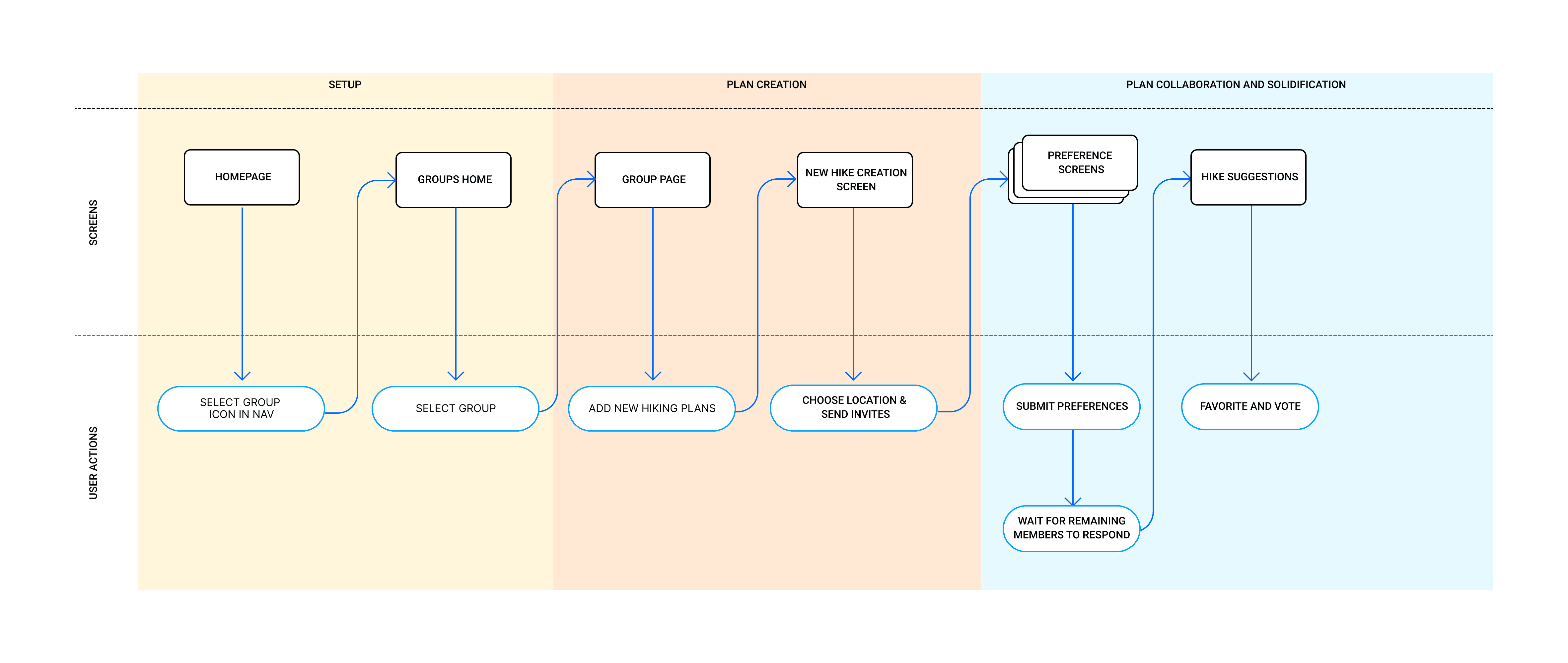
Defining the Pathway for AllTrails Groups
From our storyboarding exercise, we worked to define a user task flow to better understand how our target user would be interacting with every page of AllTrails Groups. The main goal was to identify what screens we would need to create and the actions that our users would need each screen to perform.
Designs Taking Shape
As I moved into the prototyping phase, I started with some low fidelity sketches created using Mockup. The goal of the sketches was to apply a content structure before adding any visual design. These low fidelity sketches were organized into a prototype using InVision. The goal of the InVision prototype was to conduct usability testing to determine if the user flow that we had defined was intuitive to users and uncover any areas of improvement.
After conducting usability testing on the paper prototypes and making changes according to the feedback, the sketches were translated in to low-fidelity digital wireframes.
Working Within a Design System
In order to ensure that AllTrails Groups fit seamlessly into the AllTrails App, it was important to analyze and understand the AllTrails Design System. I meticulously designed a Figma UI Kit and component library to accurately replicate the visual design of AllTrails

High Fidelity Screens
I applied the AllTrails Visual Design System to the mid-fidelity screens to create a high fidelity prototype that demonstrates the user flow of the AllTrails Groups feature. Below are a sample of some of the screens:

Front End Development
Once the user experience and user interface of the Groups tab were complete, I began looking towards the front end development of our app. Using our designs as a reference, I used Visual Studio Code and GitHub to recreate the AllTrails Groups Homepages using HTML, CSS, Bootstrap, and jQuery.
Project Results

At the conclusion of this project, my team handed off a high fidelity prototype consisting of 7 pixel perfect native app screens as well as a style guide and full component library in which adheres to the AllTrails UI Design System. We also handed off two screens coded in HTML, CSS, and Bootstrap and the corresponding GitHub Repository. Working on this project exemplified to me how much a product can change from its conception to launch. Going into the project, our team had a vastly different perception of what our final outcome would be. However, through following the guidance of our research, our product was able to take a user-centered form that none of us had imagined on day one. Moreover, I felt as though it was very valuable experience to have to work within the constraints of a design system while still creating innovative, practical, and beautiful designs.


More Projects
National Security Agency
UX Research & Visual Design
Increasing Student Retention Rates by Redesigning the NSA Home and Student Pages
Restructuring and designing a responsive website for the National Security Agency, focusing on the Student Engagement pages to help increase application submissions and student retention rates.

Colorado Animal Rescue
UX Research & Visual Design
Building Better Pet Partnerships by Gamifying Online Adoption
A responsive web design focused on restructuring information architecture, modernizing visual design, and gamifying the adoption process.
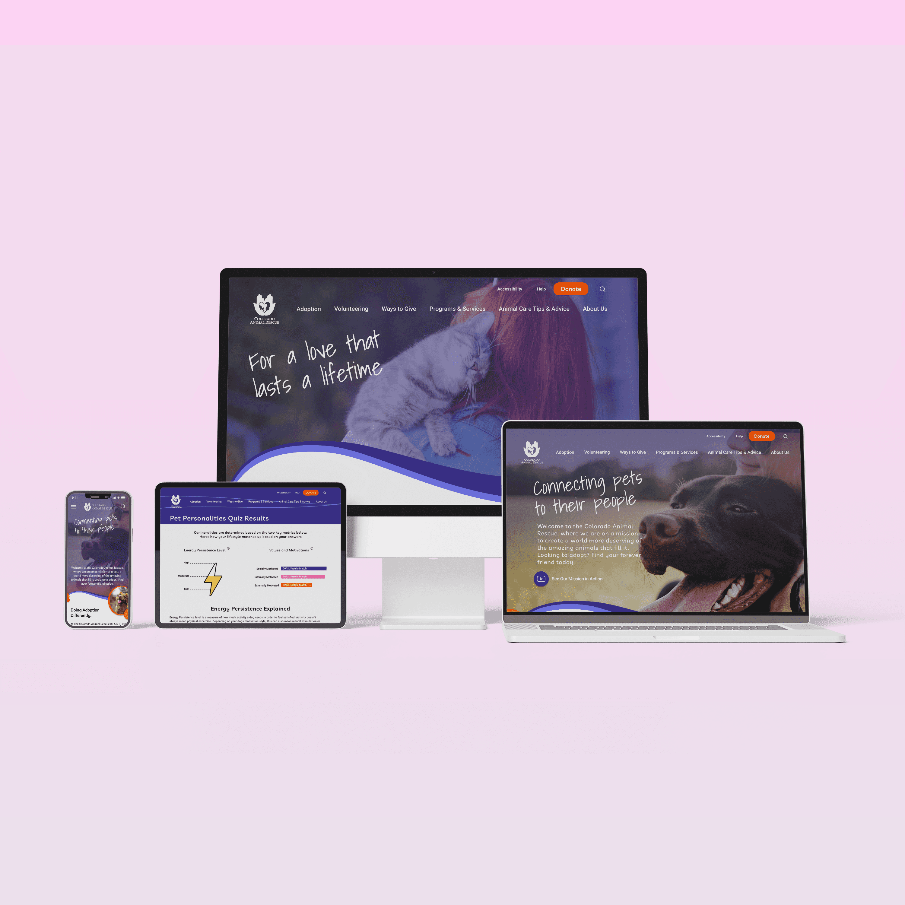
Image 8. Insights from A Health Conscious Participant
Sunny’s is an independent bookstore located in Yuma, Arizona. Our focus is on providing accessibly priced books and nourishing community along the way.
Shop
Overview
Research
Ideation
Prototype
User testing
Reflection
Small to Medium Office Buildings
K-12 School Buildings
Medium to Big Box Retail Buildings
Large Hospitals
Related Articles
Before
After
Color Selection
Typeface
Logo
Considering the information-heavy landscape design review workflow, it was essential to establish a clear visual hierarchy that doesn't overwhelm users. The neutral gradient forms a subtle foundation for this hierarchy, with the primary green aligning with the landscape theme, while the secondary colors (red, yellow, and blue) offer varying levels of user feedback that are easy to learn.
