Paving a Path to Involvement

Paving a Path to Involvement

California Preservation Foundation

California Preservation Foundation

Before

After

Before

After

Overview

Overview

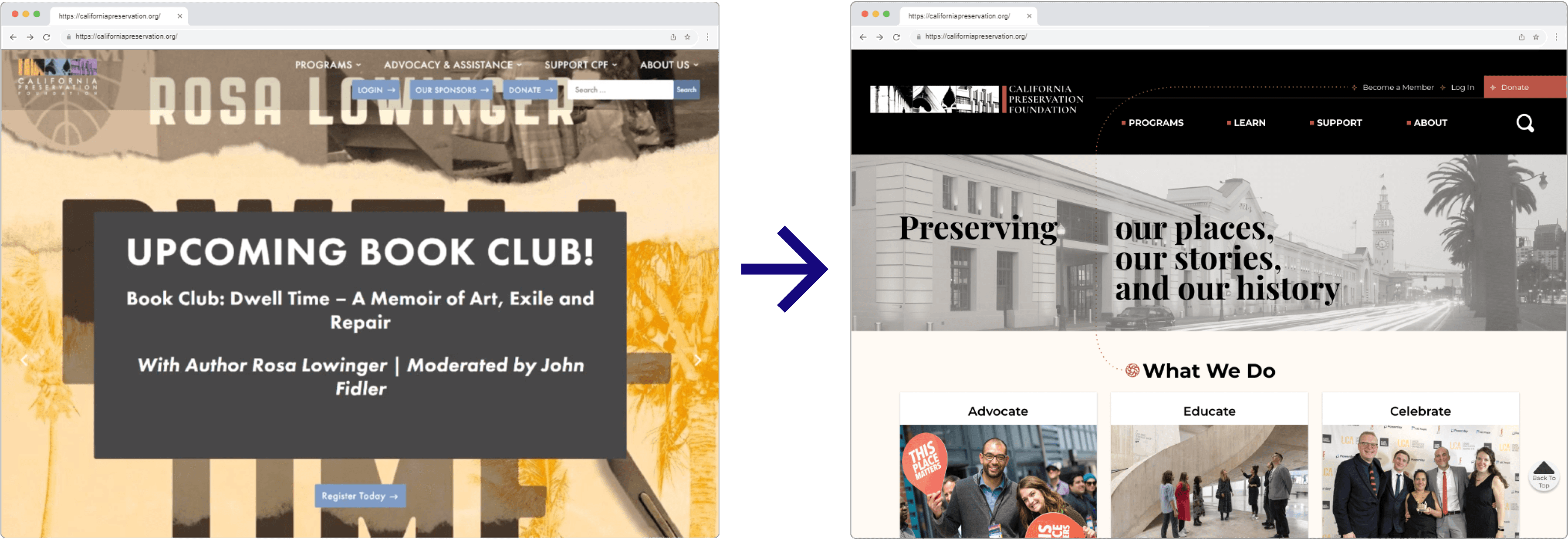
On the current website, users struggle to find information they need. Potential members visiting the site have trouble understanding the specific purpose of California Preservation Foundation (CPF), or how to become involved.Therefore, our team improved the system architecture and graphic layout of key pages in the user's journey to volunteer or donate to CPF.

As a UX Designer with ties to this non-profit I led and coordinated stakeholder engagement from initial interviewing to final project hand-off. I also managed survey writing and data analysis, assisted with website production and component development on Figma.

My Role

UX Designer

Team

Amanda Roberts, Ansley Nichols, Bray Templeton, Daniel Chang, Gabby Boodoosingh, Shelby Blue

Deliverables

Hi-fidelity web and mobile prototypes, style guide, Figma file

Skills

Stakeholder Interviewing, Heuristic Evaluation, Design System, Logo Design, Prototyping

My Role

UX Designer

Team

Amanda Roberts, Ansley Nichols, Bray Templeton, Daniel Chang, Gabby Boodoosingh, Shelby Blue

Deliverables

Hi-fidelity web and mobile prototypes, style guide, Figma file

Skills

Stakeholder Interviewing, Heuristic Evaluation, Design System, Logo Design, Prototyping

The Problem

The Problem

Outgoing young professionals who value preserving history struggle to quickly understand the purpose and impact of the California Preservation Foundation and how they can contribute, due to a distracting amount of content and poor site navigation.

The Solution

The Solution

The Impact

πŸš€

Design proposals for Donation and Membership pages launched in Jan 2024

12% ⬆️

Increase in Membership page conversion rate

8% ⬆️

Increase in number of donations processed through website

πŸš€

Design proposals for Donation and Membership pages launched in Jan 2024

12% ⬆️

Increase in Membership page conversion rate

8% ⬆️

Increase in number of donations processed through website

πŸš€

Design proposals for Donation and Membership pages launched in 2024

+8%

Increase in number of donations processed through website

+12%

Increase in Membership page conversion rate

My Role

UX Designer

Team

Amanda Roberts, Ansley Nichols, Bray Templeton, Daniel Chang, Gabby Boodoosingh, Shelby Blue

Deliverables

Hi-fidelity web and mobile prototypes, style guide, Figma file

Skills

Stakeholder Interviewing, Heuristic Evaluation, Design System, Logo Design, Prototyping

Evaluating the Existing Product

Evaluating the Existing Product

What is the California Preservation Foundation?

The California Preservation Foundation provides statewide leadership, advocacy, and education to ensure the protection of California’s diverse cultural heritage and historic places both architectural and naturally occurring. Their core programs include webinars, an annual conference with workshops and speakers, and a statewide set of historic site tours.

Heuristic Evaluation

Heuristic Evaluation

Understanding Stakeholder Goals and the User Base

Understanding Stakeholder Goals and the User Base

Stakeholder Interview

As a current Education Committee member of CPF, I led the interview with its three staff members Cindy, Jon, and Lisa. Our team did a walkthrough of site areas that CPF staff were concerned with. From there, we inquired about their vision for the new site and goals for the future.

Stakeholder Goals

1

Membership

Increase visitor conversion rate

2

Branding

Highlight core events so they're easily identifiable

3

Fundraising

Communicate how donations are being used

4

Volunteering

Make sign-up forms easy to find and fill out

1

Membership

Increase visitor conversion rate

2

Branding

Highlight core events so they're easily identifiable

3

Fundraising

Communicate how donations are being used

4

Volunteering

Make sign-up forms easy to find and fill out

User Research Question

Do young professionals have an interest and availability to volunteer with an architectural preservation nonprofit?

Quantitative Research

Aligning with the stakeholders' goal to increase membership, we distributed a survey to mostly young professionals in our networks to discover the constraints around involvement with nonprofits and motivations regarding historic preservation. The survey garnered a total of 24 responses. Question types included multiple choice, short answer, yes/no, and scale rating.

User
Insight

User
Insight

Gen-Z and Millennial professionals are involved in their communities, and are interested in spending 3-10 hours per month volunteering.  

Broadening Target Demographic to Grow Membership

Current Target

πŸ§“

πŸ§“

πŸ§“

Established Professionals

Established Professionals

To improve the experience of the current website user base:

We altered the system architecture as well as hierarchy throughout to create a simpler user-experience.

To improve the experience of the current website user base:

We altered the system architecture as well as hierarchy throughout to create a simpler user-experience.

To improve the experience of the current website user base:


We altered the system architecture as well as hierarchy throughout to create a simpler user-experience.

New Target

πŸ‘©

πŸ‘©

πŸ‘©

Young Professionals

Young Professionals

To create an easy and inviting path to involvement for our new target user base:

Our team addressed brand identity issues, clearly outlined the types of committees, and broke down the ways to make a donation.

To create an easy and inviting path to involvement for our new target user base:

Our team addressed brand identity issues, clearly outlined the types of committees, and broke down the ways to make a donation.

To create an easy and inviting path to involvement for our new target user base:


Our team addressed brand identity issues, clearly outlined the types of committees, and broke down the ways to make a donation.

User Goals

1

Purpose

Find out what CPF does as an organization

2

Paths

Discover different options for getting involved

3

Sign-up

Easily fill out a volunteer form and know the function of the role

4

Donate

Quickly access and choose between clear options for giving

1

Purpose

Find out what CPF does as an organization

2

Paths

Discover different options for getting involved

3

Sign-up

Easily fill out a volunteer form and know the function of the role

4

Donate

Quickly access and choose between clear options for giving

Looking to Competitors for Design Inspiration

Looking to Competitors for Design Inspiration

We analyzed the websites of related California nonprofits LA Conservancy and California Historical Society to look for brand identity UI patterns and donation modules to inspire our design.

We analyzed the websites of related California nonprofits LA Conservancy and California Historical Society to look for brand identity UI patterns and donation modules to inspire our design.

We analyzed the websites of related California nonprofits LA Conservancy and California Historical Society to look for brand identity UI patterns and donation modules to inspire our design.

Drop-down navigation menu

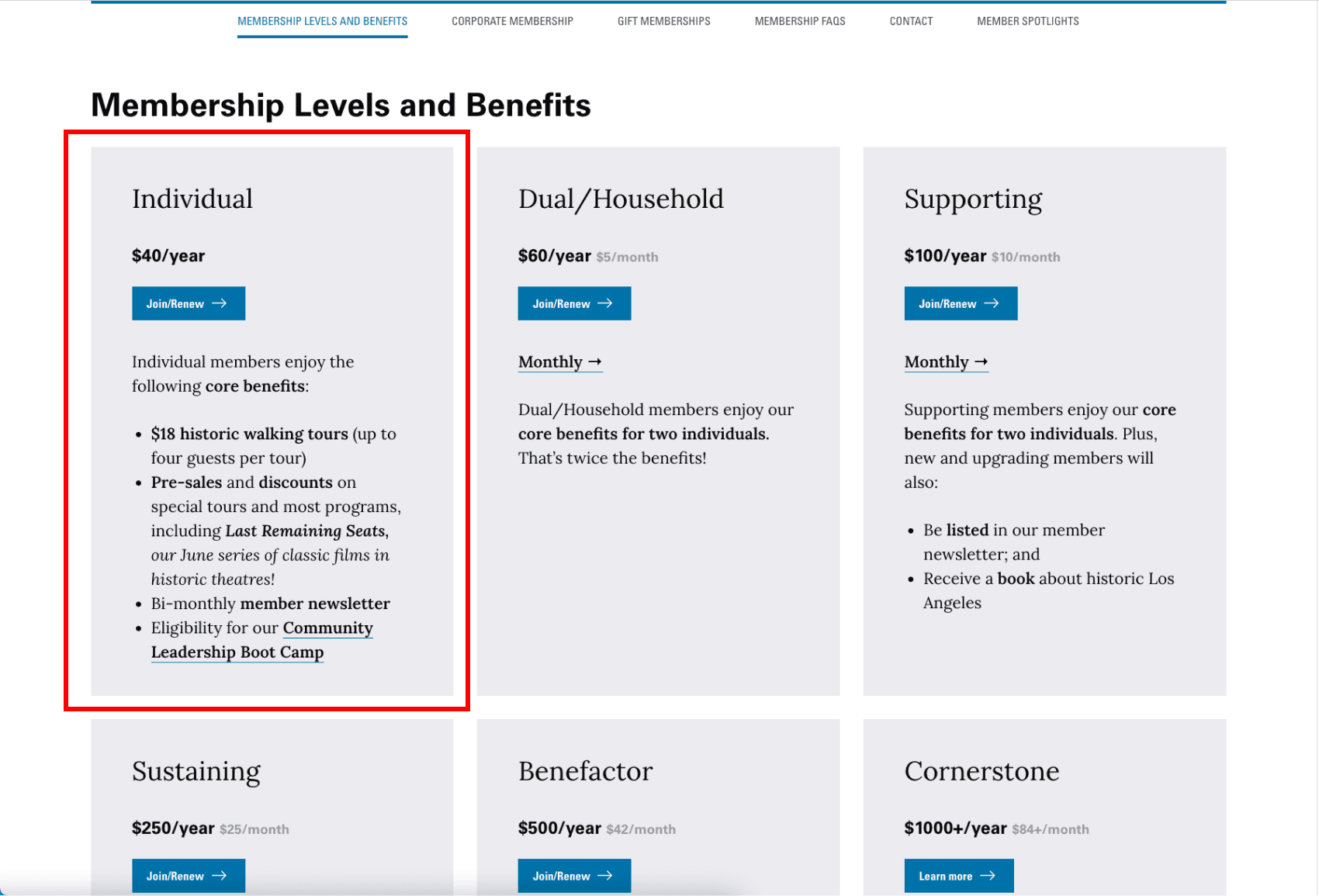
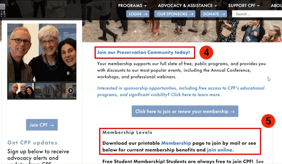
Membership tier breakdown
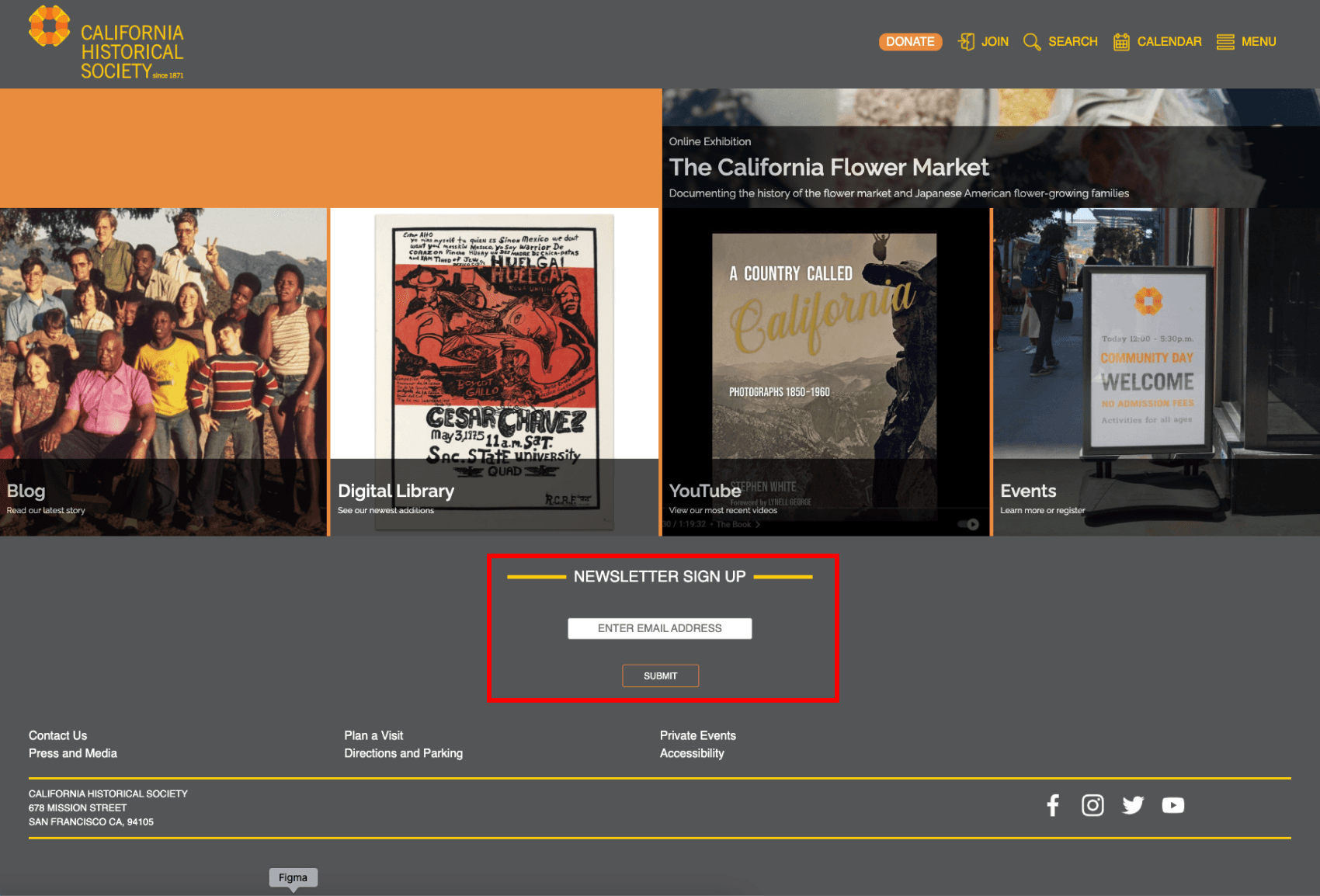
Email sign-up

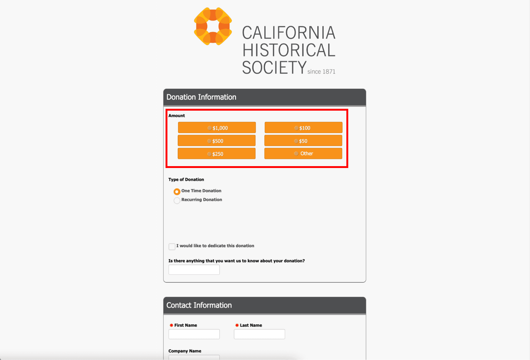
Set donation options

Takeaways

  1. Navigation bar dropdown fills the entire page width which makes navigation easy

  2. Visually breaking down membership types in card format eases decision making

  3. Locating newsletter sign up at bottom of page is common practice

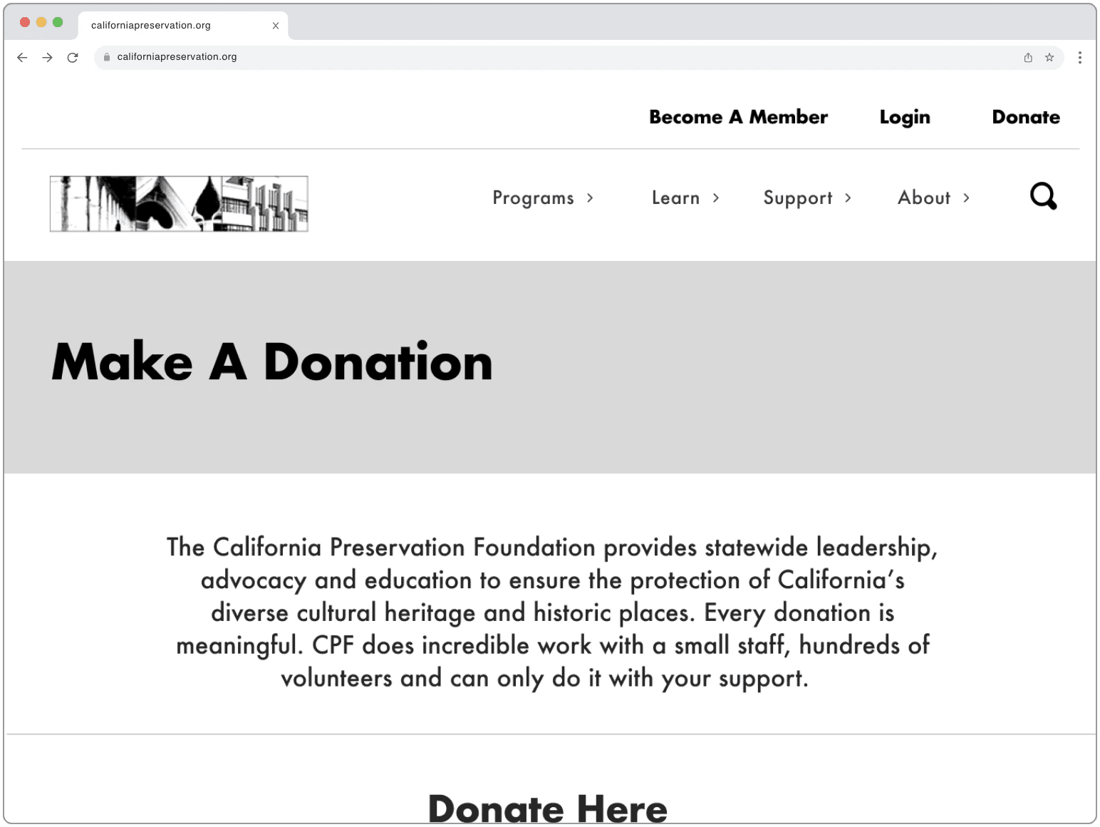
  4. Providing options for donation amount reduces friction when users are making a choice

Designing Straightforward Mockups

Designing Straightforward Mockups

Our team crafted lo-fi desktop and mobile prototypes prioritizing the communication of CPF’s mission and core events, while introducing a reorganized system architecture and navigation bar to direct users to donate or become involved more easily than before.

Usability Testing

Usability Testing

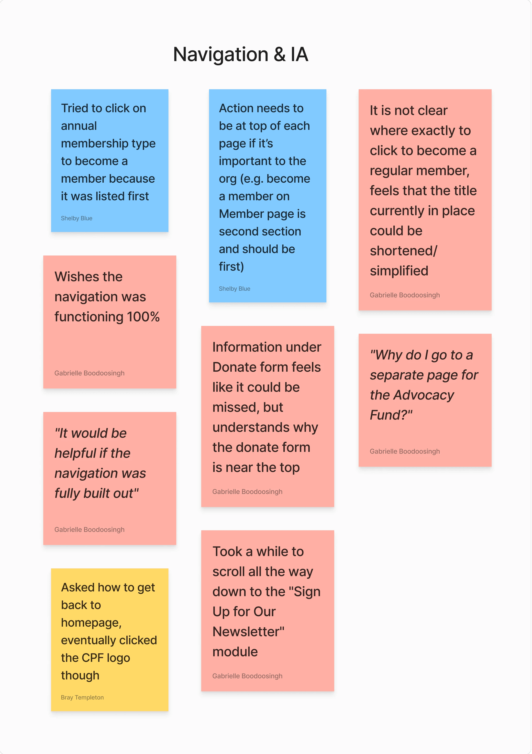
Six of our team members administered live one-on-one usability tests of our lo-fi prototype over Zoom. Later, we card-sorted the responses and found the trends to be site navigation, verbiage and brevity of descriptions, and page design in terms of proportions and ability to skim without scrolling too much.

What We Learned

  1. The primary action of a page needs to be at the top.

  2. There is confusion with the difference between email list, newsletter, and membership.

  3. Pages are too long and graphic elements are too large.

User Tasks

1

Find how to sign up for the email list

2

Identify the 4 core programs of CPF

3

Find how to become a member of CPF

4

Make a donation to the Advocacy Fund

1

Find how to sign up for the email list

2

Identify the 4 core programs of CPF

3

Find how to become a member of CPF

4

Make a donation to the Advocacy Fund

Finalizing and Launching

Finalizing and Launching

Logo Redesign

Existing

New

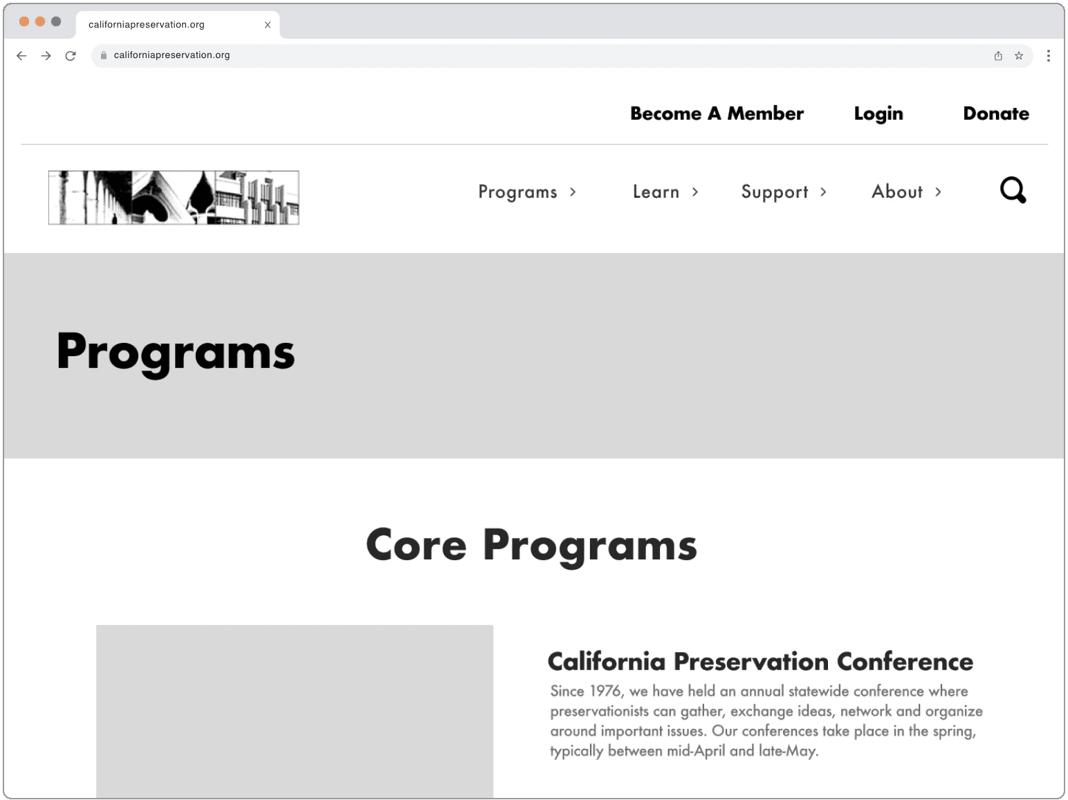
Design Changes Implemented by CPF

As of January 2024, CPF has incorporated design elements from our design including the mission breakdown on the homepage, donation form module, and membership tier breakdown. You can view these changes live at californiapreservation.org.

As of January 2024, CPF has incorporated design elements from our design including the mission breakdown on the homepage, donation form module, and membership tier breakdown. You can view these changes live at californiapreservation.org.

As of January 2024, CPF has incorporated design elements from our design including the mission breakdown on the homepage, donation form module, and membership tier breakdown. You can view these changes live at californiapreservation.org.

Donation form

Membership page

Lessons Learned and Reflection

Lessons Learned and Reflection

πŸ“ˆ

Building a product with growth in mind allows new elements and features to be integrated easily

🀝

Showing stakeholders how a simpler palette emphasizes their existing work flatters and incentivizes them to buy into the proposed design

πŸ‘¨β€πŸ‘¦

Some UX elements need to be tested at different levels of fidelity

🎯

Conciseness is key

In an ideal world…

I would push harder on stakeholders to involve our team in the implementation process. California Preservation Foundation was apprehensive to do a full redesign and only adopted several elements of our design at first. They are currently working with another designer to implement the full website by the end of 2024.

I should have confidently presented a projected timeline including a breakdown of design phases and cost associated with them. Offering to collaborate on a refined CMS might have persuaded them as well.